


This Gift box packaging for Vireo is definitely one of my favourite projects I’ve done so far.
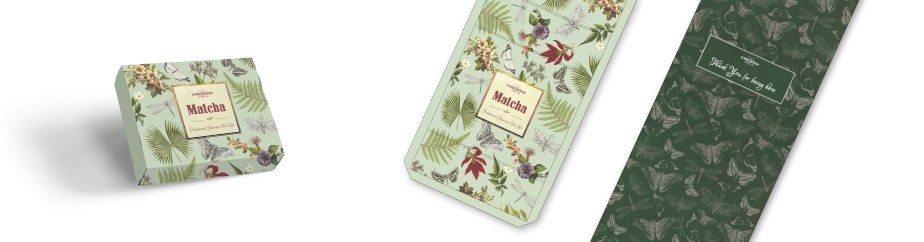
Dziugas Augustinavicius (founder of Vireo International Ltd.) has been selling this Matcha gift box that includes a pouch of matcha tea powder, 2 bamboo spoons, a whisk and a bowl and asked me to design a new packaging for it. He gave me a short brief which was mainly about the feel he wanted the box to have. He wanted a jungle-like design that looks green, lively and vigorous and that reflects on his brand – the word Vireo means ‘be full of youthful vigor, be green or verdant, be lively or vigorous’ in Latin.
I initially showed him around 4 ideas, 1 of which was an all over pattern that consisted of vintage illustrations of exotic-looking plants and animals. He really loved the concept, however, he asked me to remove a few of the animals, such as snake, scorpion, bat, some bugs and leave only the ‘friendly’ insects, which were the butterflies and dragonflies. Even though I thought that the ‘black listed’ animals looked beautiful and would have made the box look really unique and jungle-ish, I understood his reasoning, and edited the file accordingly. I was still very happy with how the pattern looked and so was he and it’s not always easy to find this common ground where both the client and the designer are happy with the art work.
As far as the pattern on the inside goes, I only used the butterflies and dragonflies to create a seamless pattern. Dziugas suggested to try out a dark background which I secretly wanted to do anyway because high contrast is my jam, haha. When it comes to boxes or cards for instance I love that element of surprise when you open the thing, and the colours on the inside are on the other end of the spectrum compared to the outer colours. Later on I was asked to create a navy blue version for the outer cover by the way, and I must say, pairing dark colours with dark colours also works for me!
And finally, the label remained quite minimalistic which we both agreed on. The pattern was quite loud already so the label needed to be simple to maintain balance.
